Brand & Media Kit

The SUITE brand,
and how to use it.

Official logo files, colour values, typography and usage rules for press, partners, integrators and directories. Everything here is approved artwork — please place the supplied files rather than recreating them.

01

Primary logo

The horizontal lockup is the default. Use the stacked lockup where width is constrained, and the hexagon mark alone only where the brand is already established in context.

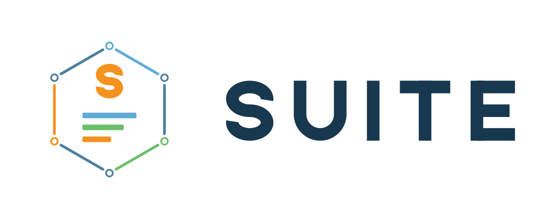
SUITE horizontal logo, full colour
Horizontal lockupDefault. Navigation, headers, email signatures, directory listings.
SUITE stacked logo, full colour
Stacked lockupSquare-ish spaces, print covers, merchandise, social profiles.
SUITE hexagon icon
Hexagon markApp icons, favicons, avatars. Not a substitute for the full lockup.
02

Colourways

Full colour is preferred wherever reproduction allows. Reversed (white) artwork is for dark surfaces; navy and black exist for single-colour reproduction such as print, engraving and fax.

Full colour on light
Full colour on lightPrimary treatment on white and near-white surfaces.
Reversed on dark
Reversed on darkUse on Infrastructure navy and other dark grounds.
Deep Navy single colour
Deep NavySingle-colour reproduction where full colour is unavailable.
03

Clear space & minimum size

Protect the mark so it never competes with surrounding elements.

Clear space.
Keep clear space equal to the height of the “S” on all four sides of the lockup. Nothing — type, rules, imagery or page edge — should enter that margin.
Minimum size.
Hexagon mark: 24 px on screen / 0.25 in in print.
Horizontal lockup: 96 px on screen / 1 in in print.
Below these sizes the stacked bars stop resolving cleanly.
04

Colour palette

The complete approved palette. Do not introduce colours outside it, and do not reorder the hexagon sides or the stacked bars — both sequences are fixed parts of the artwork.

NameRoleHEXRGBCMYKPantone
Signal OrangePrimary accent, the “S”#F5911E245 145 300 / 41 / 88 / 41375 C
Data BlueSecondary accent, links#5FABD695 171 21456 / 20 / 0 / 16292 C
System GreenTertiary accent, success#6BBF6B107 191 10744 / 0 / 44 / 25359 C
Deep NavyLight-mode ink, icon grounds#17384F23 56 7971 / 29 / 0 / 69302 C
InfrastructureDark-mode background#06111B6 17 2778 / 37 / 0 / 89Black 6 C
SteelConnector sides, muted text#4D7F9E77 127 15851 / 20 / 0 / 385405 C
CloudWordmark on dark grounds#F2F7FA242 247 2502 / 0 / 0 / 2
WhiteReversed logo, light surfaces#FFFFFF255 255 2550 / 0 / 0 / 0
BlackSingle-colour print, engraving#0000000 0 00 / 0 / 0 / 100Black
Contrast. Cloud on Infrastructure and Deep Navy on White both reach AAA. Data Blue on Infrastructure is AA for body text. Signal Orange on dark is AA for large text and icons only — never set body copy in Signal Orange on white; use Deep Navy.
05

Typography

Poppins is the brand typeface for everything around the logo. The SUITE wordmark itself is outlined vector artwork, not live type — it is never set from a font.

Display / hero
700 Bold
Run the whole business
Headings
600 SemiBold
Estimates, invoices, scheduling
Eyebrows / labels
600 uppercase, +0.25em
Brand & Media Kit
Body
400 Regular, 1.6–1.75
SUITE brings contacts, deals, communication history and automated follow-up into one workspace.
Fallback stack
Poppins, "Helvetica Neue", Helvetica, Arial, sans-serif
06

What not to do

The lockups are fixed artwork. These are the changes that most often break the mark.

Don’t retype the wordmarkSUITE is outlined artwork. Always place the supplied vector or PNG.
Don’t recolourNo colours outside the approved palette, and no gradients on the mark.
Don’t stretch or rotateScale proportionally only. Never distort, skew or rotate the lockup.
Don’t add effectsNo shadows, glows, outlines, strokes or bevels on the artwork.
Don’t reorder the artworkHexagon side sequence and the blue → green → orange bar order are fixed.
Don’t crowd itRespect clear space equal to the height of the “S” on all four sides.
Don’t attach the accent ruleThe gradient rule is a marketing element — never join it to the lockup.
Don’t reverse full colour on darkUse the supplied reversed artwork; the navy wordmark disappears on dark.
Don’t write “Suite”Always “SUITE” in full caps. Never “Suite” or “The SUITE”.
07

Downloads

SVG and PDF are RGB vector for screen and digital print. EPS is CMYK for commercial print. AI opens directly in Illustrator. PNG is transparent unless the filename says otherwise.

Download the complete kit · ZIP

Horizontal lockup

Stacked lockup

Hexagon mark

Corporate attribution & wordmark

08

Naming & boilerplate

Please use the product name exactly as written below. On first mention, pair it with the legal entity.

Naming. Always “SUITE” in full caps — never “Suite” or “The SUITE”. First mention: “SUITE, by Low-IP, LLC”. Legal entity: “Low-IP, LLC”.

Short

SUITE is a customer relationship platform that keeps contacts, pipeline and follow-up in one connected system.

Standard — 50 words

SUITE is a CRM platform built by Low-IP, LLC for teams that outgrow spreadsheets but do not want enterprise complexity. It brings contacts, deals, communication history and automated follow-up into one workspace, so every customer relationship stays visible, current and easy to act on.

Questions about using the brand?

If you need a format that isn’t here, or you’re unsure whether a particular use is appropriate, get in touch before you publish.

Contact our team

SUITE and the SUITE hexagon mark are trademarks of Low-IP, LLC.